Bauhaus Website
Late 2018- Branding
- Graphic Design
- UX
A design project for 'bauhaus|collectiv'; a theoretical brand that specialises in selling genuine bauhaus artefacts.
Branding
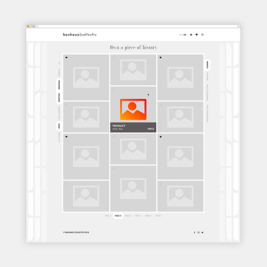
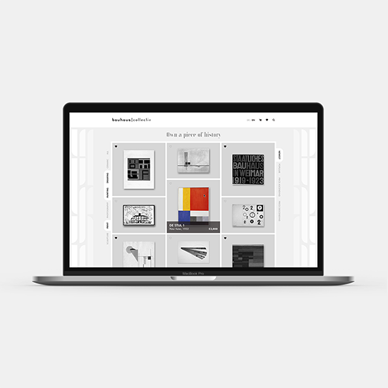
User Interface
A simplistic monochrome palette compliments a UI that wraps around the content, the side patterning takes inspiration from the typological form of the Joschmi font. Colour is used sparingly to highlight when the user mouseovers a product, this is done to give the user focus and to respect each individual artwork piece.
This project was completed as an entry into the Adobe Hidden Treasures design competition.


