Happyhour
Late 2015- Branding
- Development
- Graphic Design
- UX
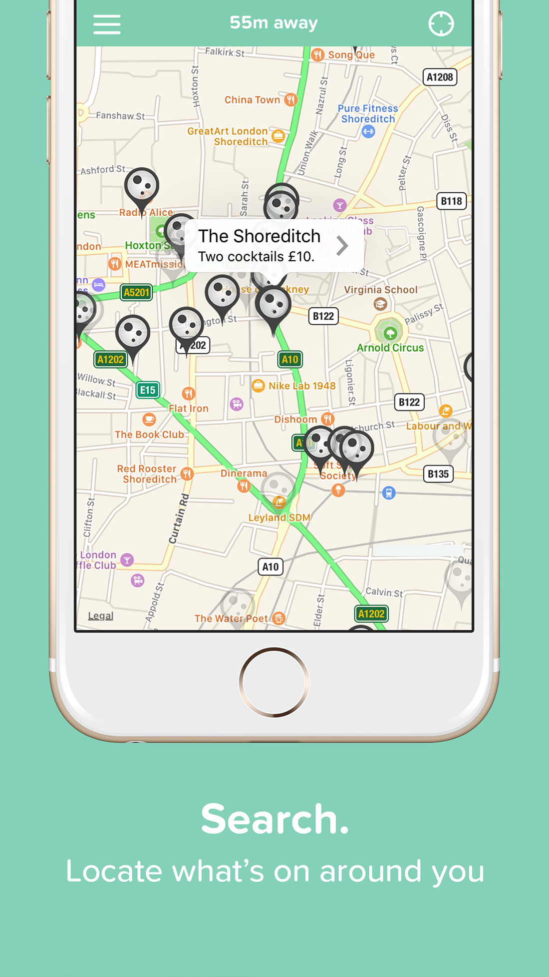
Happyhour is an iOS smartphone application that provides a platform for venues to advertise promotional deals to potential customers in a real-time. The idea arose from the acknowledgement of an unserved market need, paired with the shared annoyance of being unable to easily discover the availability of local happy hours.
Branding
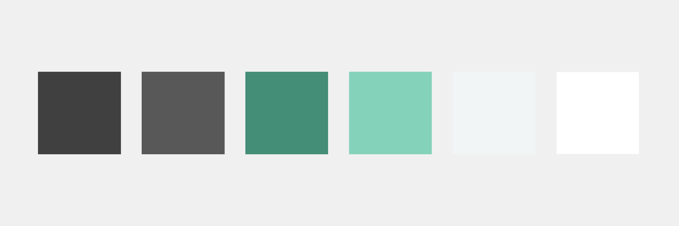
The colour scheme consists of a monochromatic palette of pastel green with varying accent shades of grey and white. The soft green evokes a pleasant calming feeling helping to harmonise the brand design. The less-saturated colours offer a soothing sensation and do not overwhelm the user, whilst still commanding a strong presence.
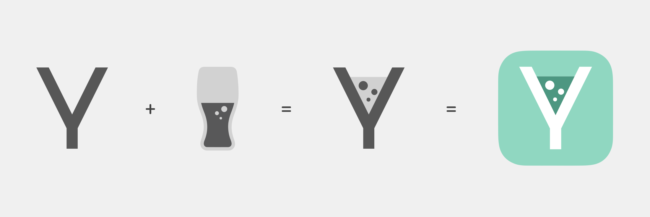
The logo utilises the Alpaca Scarlett font, giving the letter 'Y' a centralised position. This unlocks the opportunity to explore aspects of the typography in order to accommodate a graphic logo. The logo itself drew inspiration from its context, an application that focuses on social drinking naturally accommodates a logo that envisages the ‘Y’ as a cocktail glass. The bubble elements within the glass are proportioned according to the golden ratio.
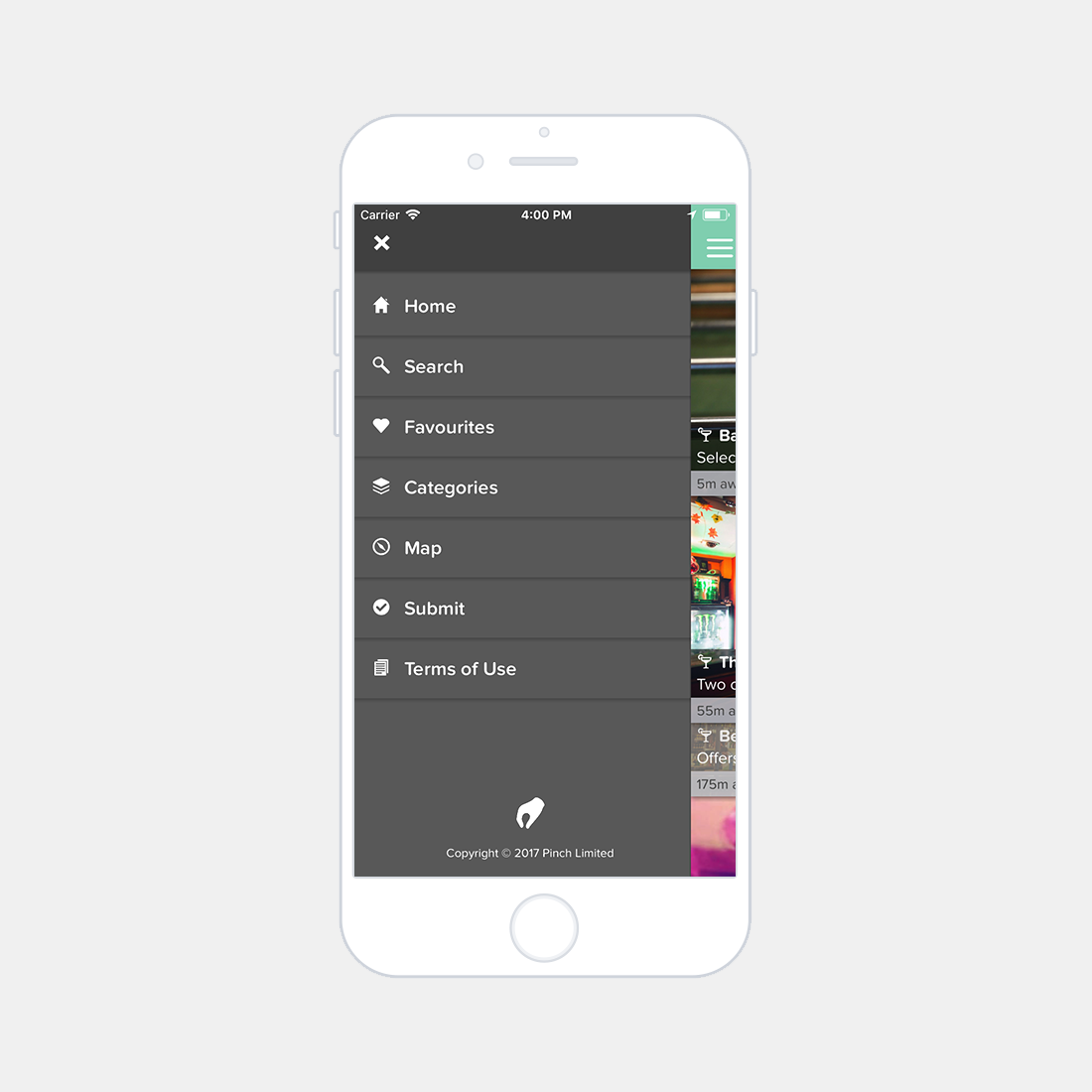
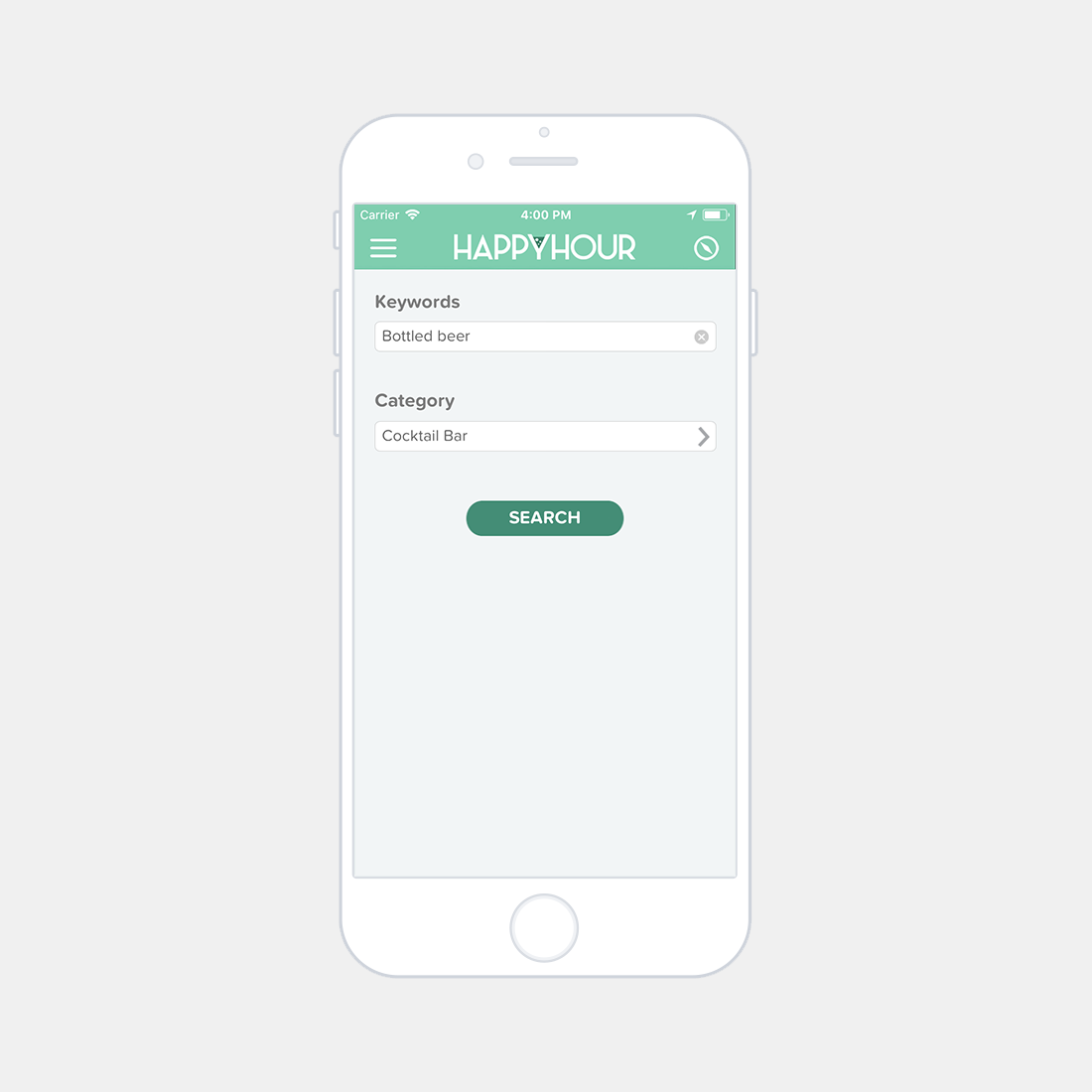
Screenshots
Graphical User Interface
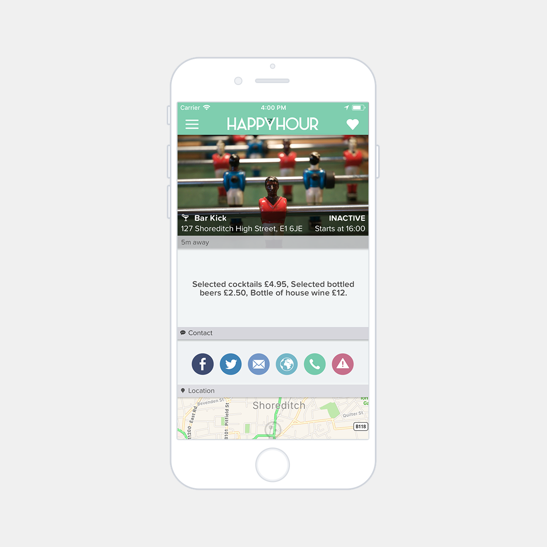
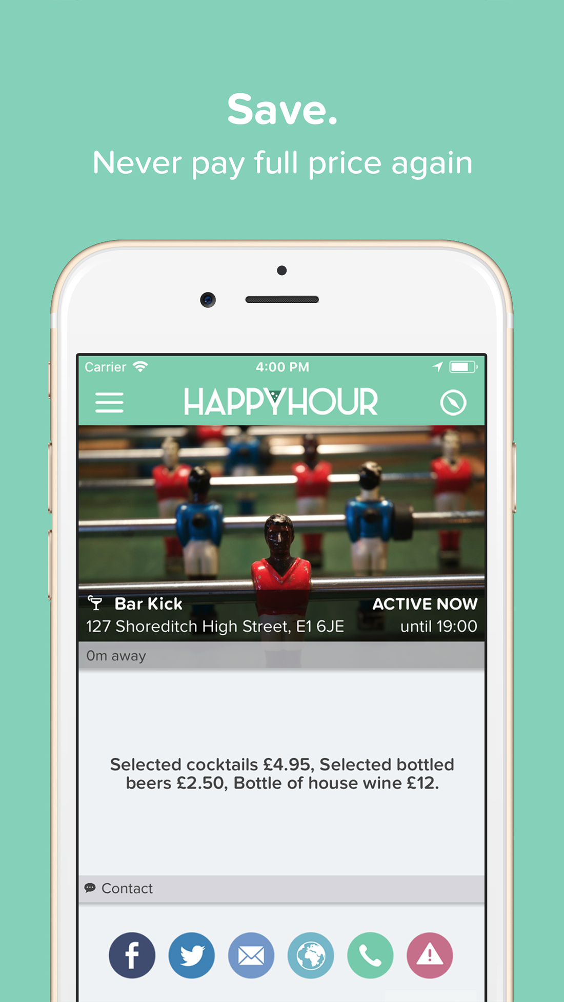
The contact bar is shown at the bottom of the venue details page and gives the user numerous methods of interacting with the venue. The buttons are graphically indicitive of their purpose, relating to 'Facebook', 'Twitter', 'Email', 'Website', 'Phone' and 'Error Reporting' respectively. Functions that require external applications prompt the user before progressing, this is especially useful when dealing with user error. Aesthetically, the buttons respond to other elements within the application due to their rounded shape. A softened pastel theme has also been applied to visually connect the buttons to the branding and colour scheme of the application. In conjunction with this a visual link between the Happyhour branding and the respective external linked brandings has been retained by incorporating releant icons and colour matching.
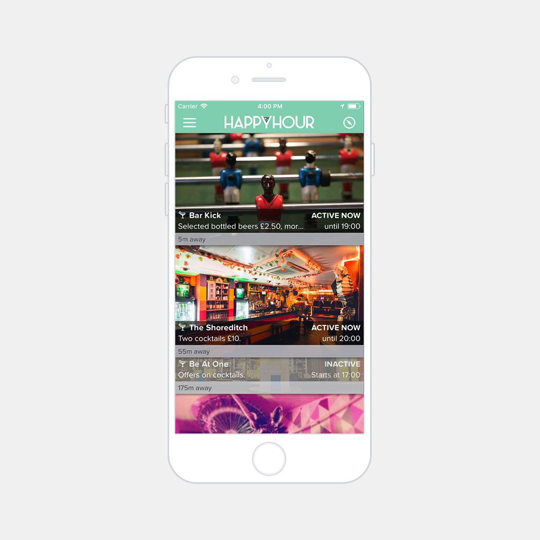
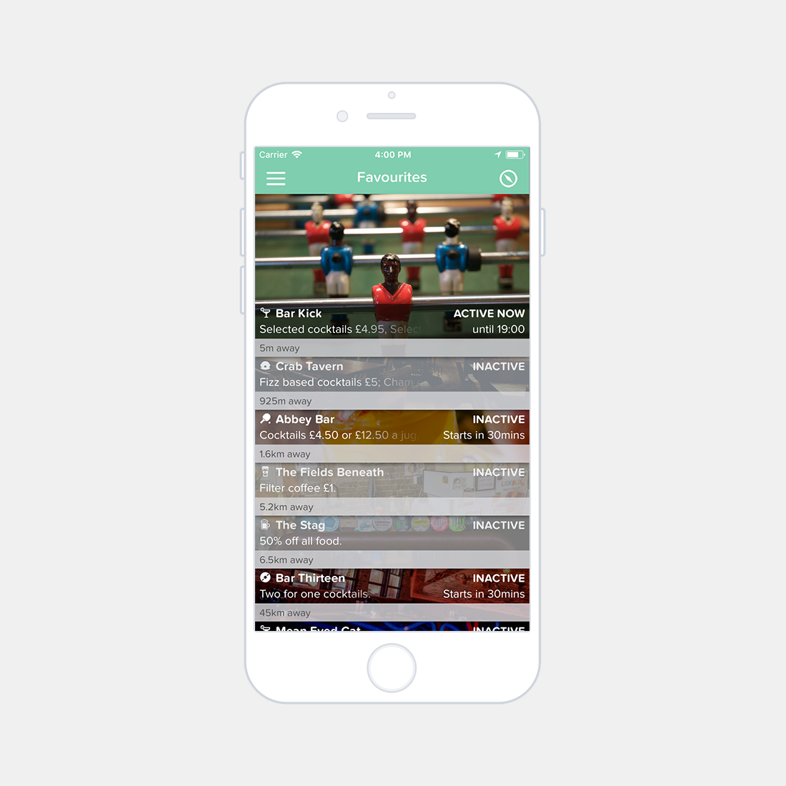
The cells within the application relate to an individual venue, each of the entries are assigned venue information, offer information, and a time of operation. The status of the offer is indicated through the cell aesthetics: • A venue with inactive offers will display a small faded cell. • A venue with inactive offers that will start within 30 minutes will display a small opaque cell with a countdown until activation. • A venue with active offers will display an expanded opaque cell, a full sized image of the venue and text that depicts the offer expiration time. • A venue with active offers that will expire within 30 minutes will display an expanded opaque cell, a full sized image of the venue and red bold text that depicts the time that the offers are valid until, signifying urgency and need for action.
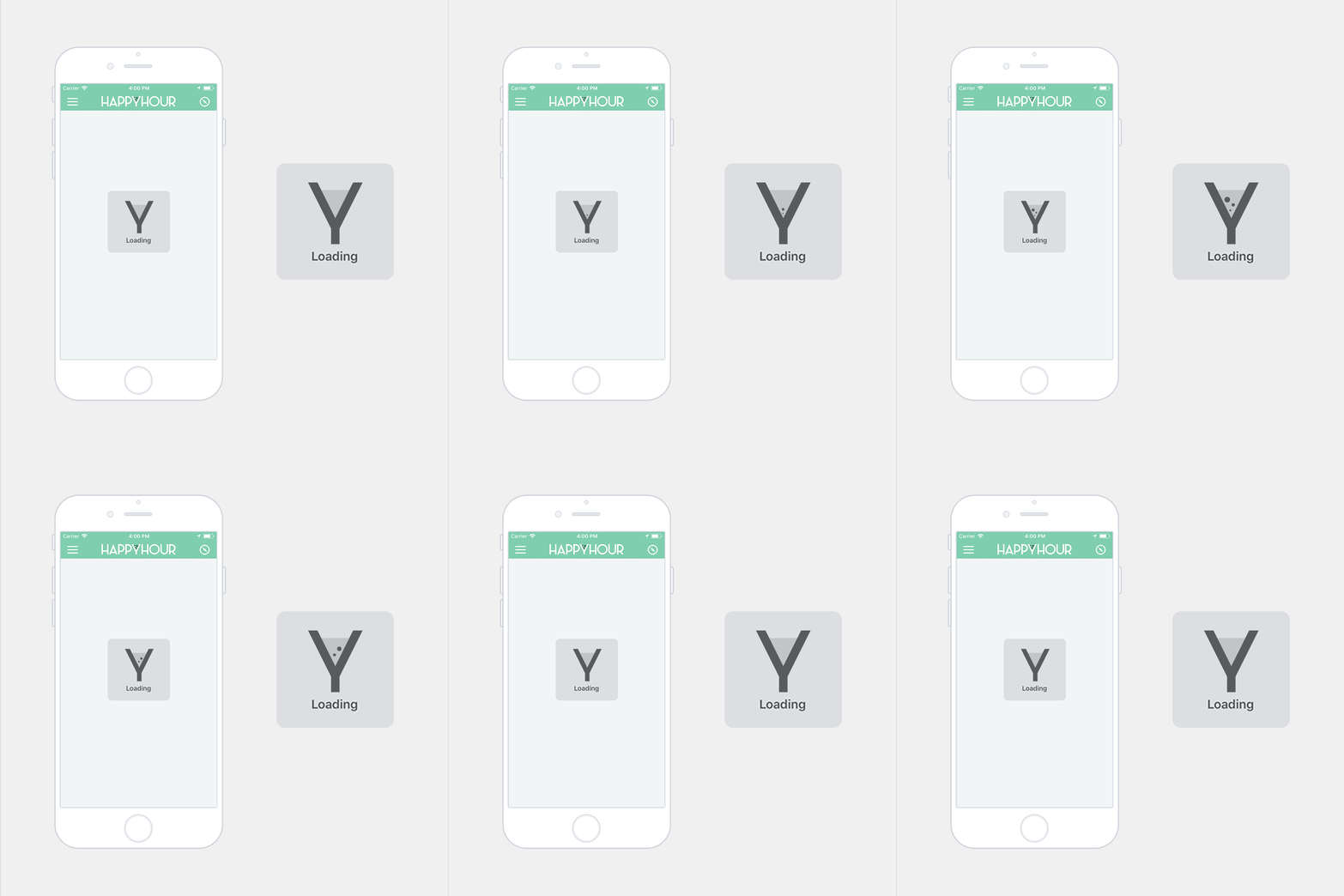
The loading indicator echoes resemblance of the aesthetic style of the native iOS operating system. This is an intentional design decision to give the user familiarity in a unified design approach across the platform. The loading animation utilises the application logo and colour scheme to display a satisfying, continious loop of the bubble elements rising and bursting within the glass.
Marketing
"We understand the frustration of trying to plan ahead on a night out - now you don’t have to. Happyhour is the free-to-use smartphone application that has the best time-based deals within the area around you."
