Roamers
Late 2018- Branding
- Client
- Development
- Graphic Design
- UX
Roamers are a natural health food brand based in Indianapolis, USA. They entrust in the power of plants as an all natural source of every day goodness, as such their slogan is 'plant powered people'. I was approached by Charlie (one half of Roamers) to redesign their existing website and reconsider their branding approach.
Previous Website
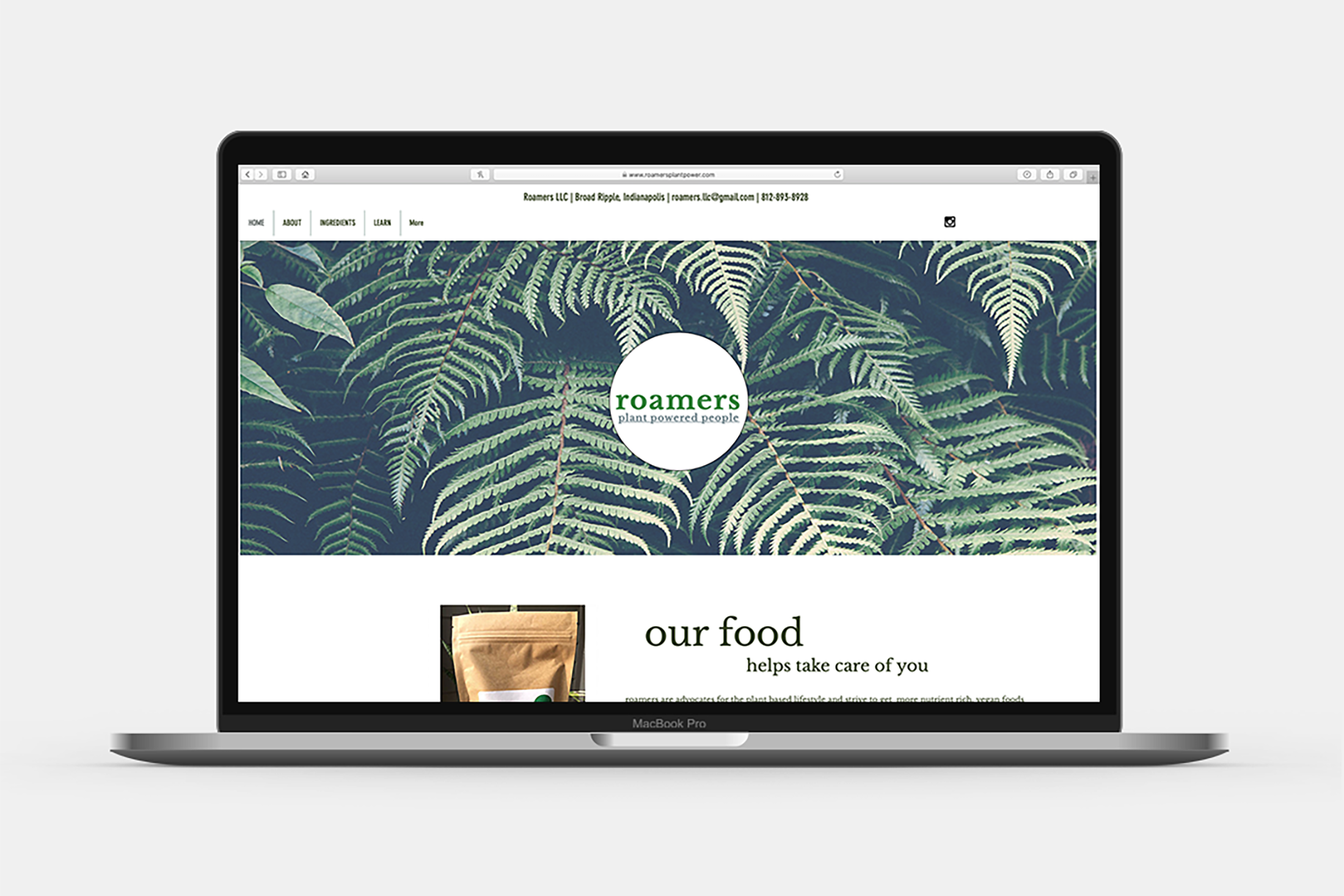

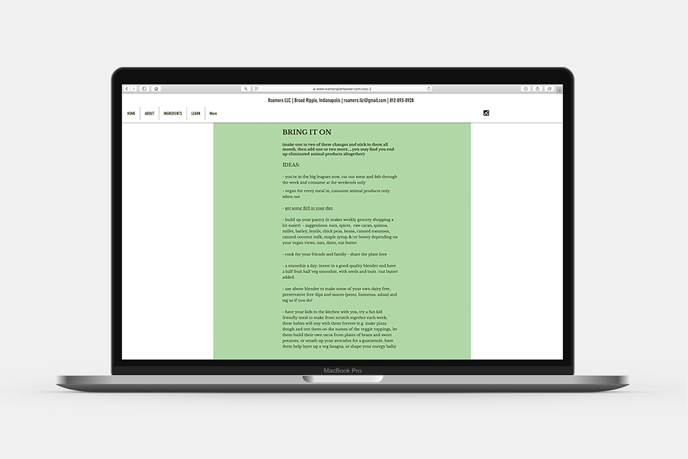

The previous website was created by Charlie using Wix.com, whilst it was functional; the navigation was complex and there was no opportunity for direct product sales.
Branding
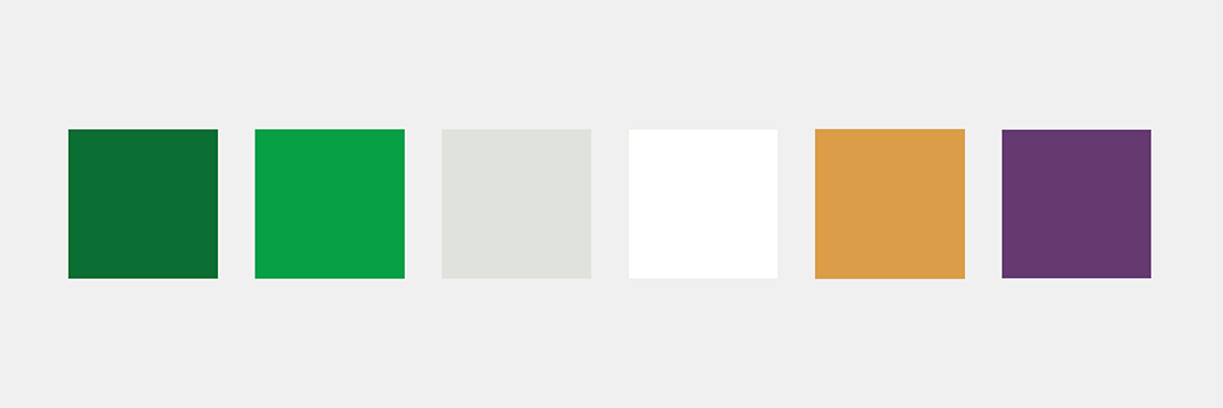
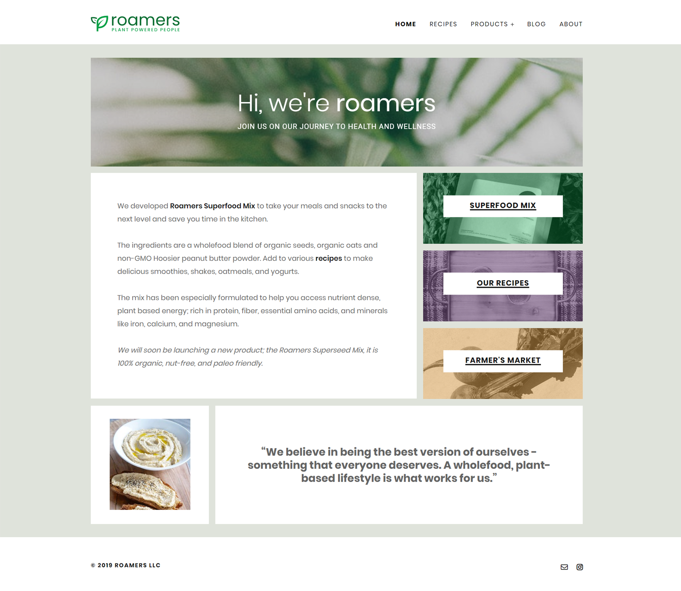
The bulk of the colour scheme consists of a monochromatic palette of pastel greens, with black and white to add contrast. Additional pastel colours are also used sparingly to distinguish separation between important elements. Green is the main colour here, it represents health, growth and positivity, this helps to harmonise the brand design. The complimentary pastel colours have also been considered, linking directly to the rich colours of the different types hummus that the brand initially produced.
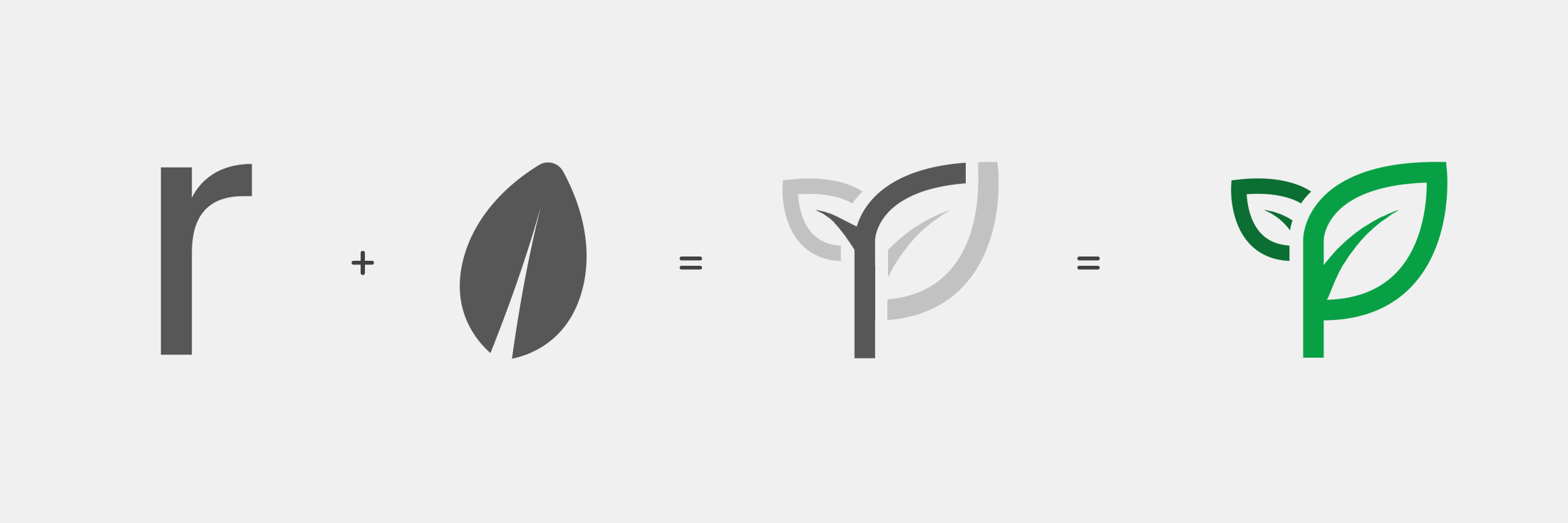
The logo utilises the Poppins font, chosen for its symmetric monolinear style. The subtext is given a small point size, a lighter colour and capitalised to retain importance and frame the main text. The graphic logo drew initial inspiration from the brand's existential values, a health aware food/supplment supplier focusing on wellbeing through natural plant powered goodness. This gave me the idea to include growth as a theme, initially identifying a new leaf as a symbol of this, I began to experiment on how I could intertwine the roamers name. The asymmetric properties of the initial letter, 'r' stood out to me as having potential to form a stalk for the new leaves to grow.
Concept
The brief requested a clean, contemporary and timeless design for the site. This involved the condesation of current pages on the site to the minimum viable. I looked to precedent websites and took inspiration from Eight Hour Day's Studio page for the initial homepage layout and from Raw and Free in terms of appropriate content to display.
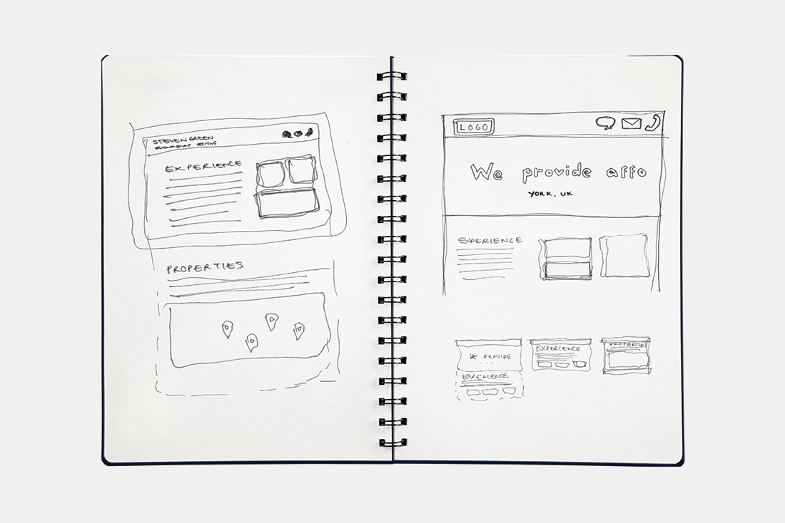
Due to the nature of the business, there was only one product to be on sale - this helped to direct the purpose of the site. From sketching some designs, I decided on key elements that would be displayed on the homepage, these were all designed to increase sales (Product itself, Recipes (which utilised the product), and local market where they made offline sales.). Attractive image overlays on to coloured buttons dealt with the three main homepage links alongside the main body text, this was intentionally designed to provide an engaging and interactive user experience.
Design
The homepage consists of a series of white/image filled boxes arranged into a grid on a contrasting light grey-green background. Within these boxes in order of appearance are: slogan banner, about section, product link, recipes link, farmers market link, Roamers instagram feed and inspirational quotation. The large button links for the product, recipes and farmers market act as a quick point of access to popular destination points on the site, for less popular destinations, the navigation bar provides easy access.
The recipes page is similar in design, however consist of a filter where the user can narrow down options of recipe such as vegan or gluten-free. Below this filter there are enticing image-based recipe links.

The Superfood Mix page is the product page of the site, it features large imagery and titles along with a drop down accordion-style information panels. The important critical information on this page is coloured to draw the users eye, for example the allergy information and the purchase button are highlighted.

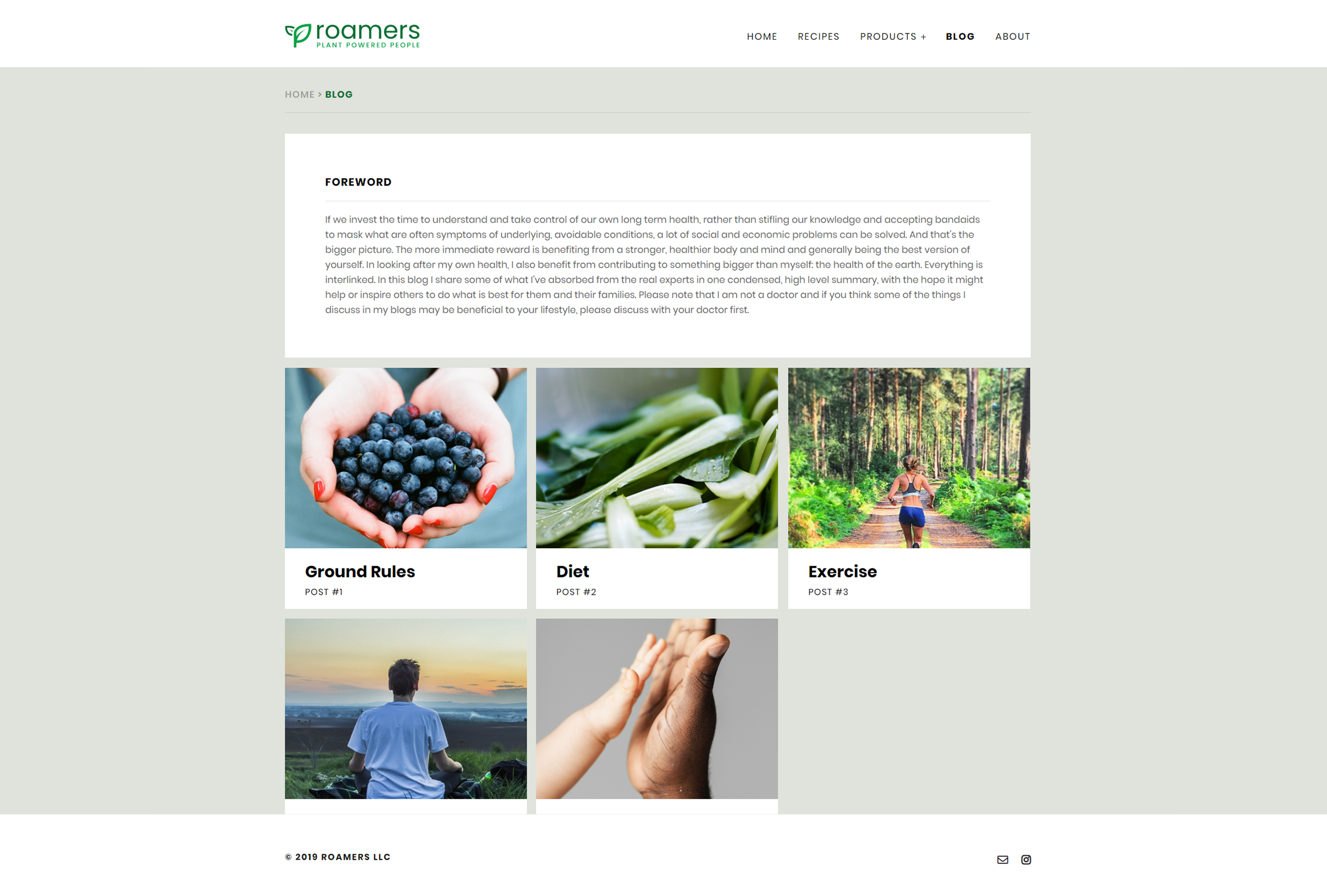
The blog has a similar layout to the recipes page, however rather than a filter there is a foreword section which introduces what the intent of the posts are. Charlie uses this page to write down important information she has concluded through research of her own.
Product
The website is responsive to screensize and scales accordingly, this is to allow for a seamless experience between mobile and desktop browser.