Steven Green Property Letting
Early 2019- Branding
- Client
- Development
- Graphic Design
- UX
Steven initially approached me with the intention of removing some outdated text and images from his website, which remained untouched since its creation in 2007. I knew I could easily improve and update the aesthetic to a timeless modern design that reflected the character of his business. He didn't want the burden of a high-maintenance website, but more of an informative landing page that gives generalised information about the company.
Existing Website

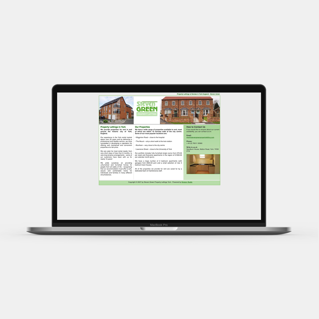
The website was very dated and showed it's age in terms of design, content and compatability.
Branding

The colour scheme consists of a palette of greens that is complimented by a rich blue and varying accent shades of grey and white. The soft green evokes a positive feeling helping to harmonise the brand design. The less-saturated colours offer a soothing sensation and do not overwhelm the user, whilst still commanding a strong presence.
I worked up a few typographical logo options and presented these - after receiving feedback that number 5 was the preferred option, I began to develop it further.
The primary font is Playfair Display, I experiemented with the font weight to create a commanding presence. It is also attributed white, whereas secondary items are attributed with a dark green colour to create eye-catching contrast. The secondary font is an uppercase version of Roboto with an extended letter spacing.
Concept
Steven wanted the website to be informative, modern and low maintenance. It was important to consider the audience of the website and what their intentions would be. The majority of the website users would be young to middle aged adults looking to a rent a property within the York region - because of this it was important to optimise the design for mobile.
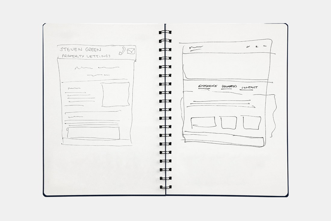
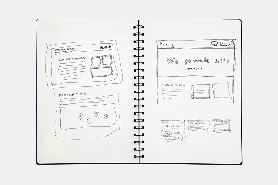
Due to the nature of the business, Steven didn't want to list specific/individual properties on the website, however wanted to give an example of a range of locations that accomdodation can be offered and some generalised company information. From sketching some designs, I decided on the idea of a carousel which would help to contain the information to one screen with distinct segments, whilst providing an engaging interactive user experience.
Design
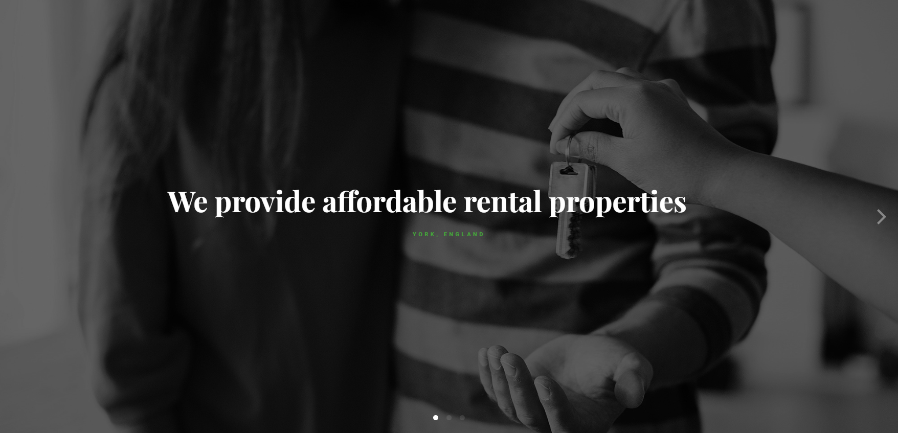
The header is formed of a solid green background and contains primary information such as the company logo and quick access contact information. To create an eye-catching contrast, the primary text of the company branding is attributed white, whereas all remaining items are attributed with a dark green colour.

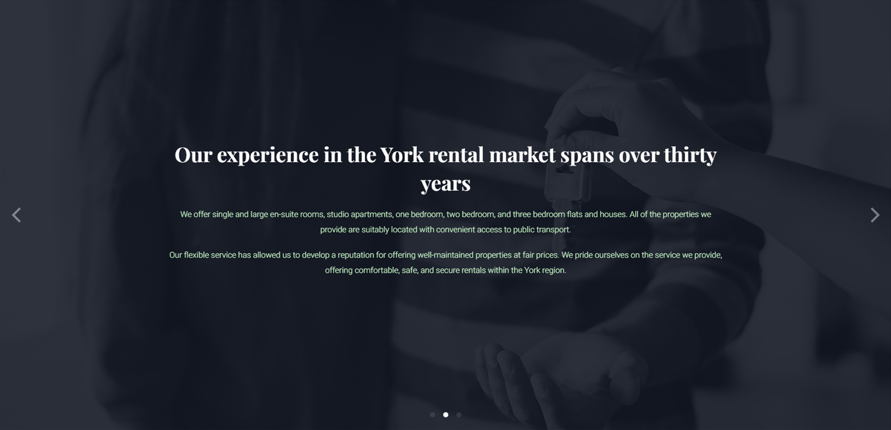
The carousel contains three main sections. The first is the tagline, an informative phrase paired with an image. The image depicts a couple being handed a set of keys, instantly informing the user of the type of business that can be expected on this domain. The accompanying text reads "We provide affordable rental properties" with subheading "York, England" which is clear in identifying the company's area of business, property rental.
The second section contains key information about the business, such as; available property types, access information, reputation, and service.
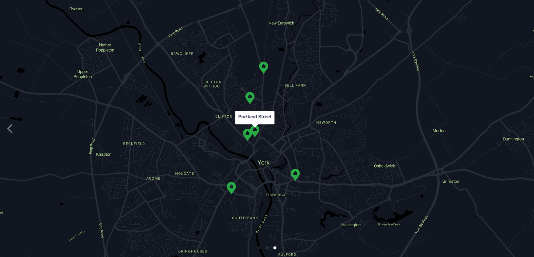
The third section shows a map customised in JavaScript, provided by Mapbox and Jawg.io. The map does not show specific properties, however it does show a range of areas in which properties can be accomodated.
The footer has a solid green background and contains primary contact and copyright information in dark green.

Product
The website is responsive to screensize and scales accordingly, this is to allow for a seamless experience between mobile and desktop browser.