Strike
Late 2018- Branding
- Graphic Design
- UX
Strike is a matched betting calculator companion for iOS that's designed with the user in mind. An increase in the popularity of the low risk gambling technique known as matched betting demands a convenient and hassle free mobile solution to lay bet calculation and profit tracking.
"Matched betting is a betting technique used by individuals to profit from the free bets and incentives offered by bookmakers. It is generally considered as risk-free betting as it is based on the application of a mathematical equation rather than chance."
Branding
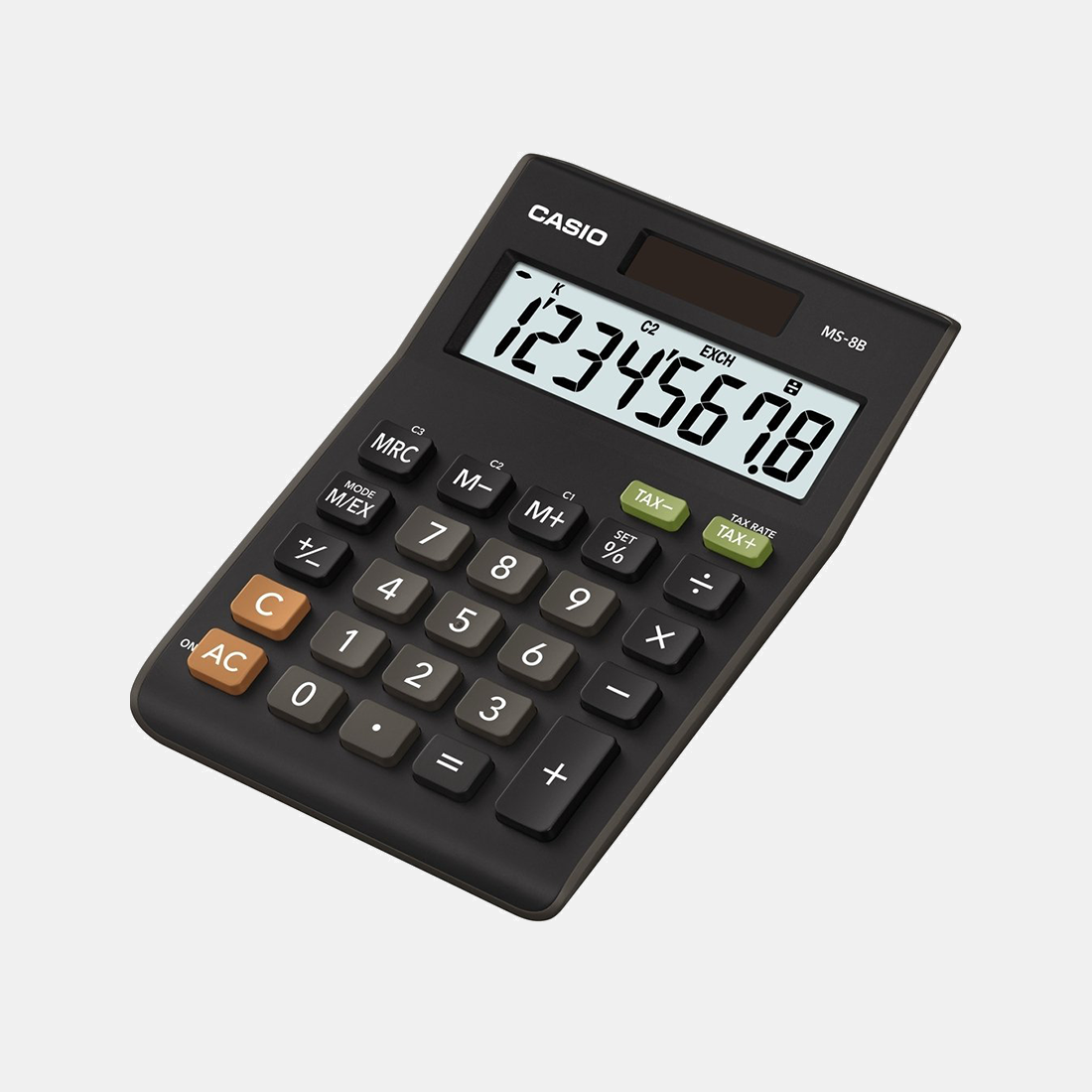
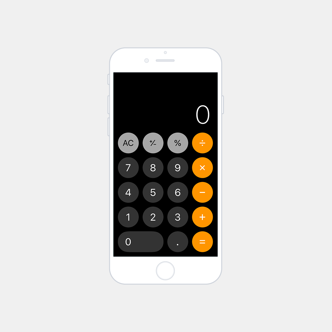
The branding colour scheme took inspiration from a classic and a modern calculator design, the Casio MS-8B and the Apple iOS Calculator. In addition to the the colours utilised on the precedent calculators, Strike utilises an additional red and green hue to indiciate respectively a negative and positive outcome to the user.
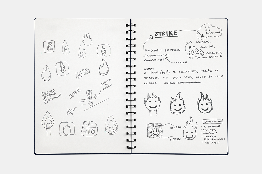
The logo and brand name are derived from a play on words of the term matched betting. Taking the inital word 'match' and analysing the definition as the real-world object provides the opportunity to develop a logo based upon the humble matchstick (with match and stick both being popular related terms). Striking a matchstick causes its head to ignite and produce a flame, analysing this primitively, it can be considered as a controlled action that produces a desired reaction. This is also the core principle behind matched betting, the idea of controlling a bet (action) to produce a positive settlement of funds (desired reaction). This thought-process derived the use of a flame as the basis for the brand’s logo. To enhance the quality of the branding, the companion attribute of the application was considered and amplified through the use of personification. This attributes the flame with recognisable features; eyes, a smile, and a name, Ember; this symbolises positivity, familiarity, and evokes a distinct friendliness.
Research
Matched Betting Blog
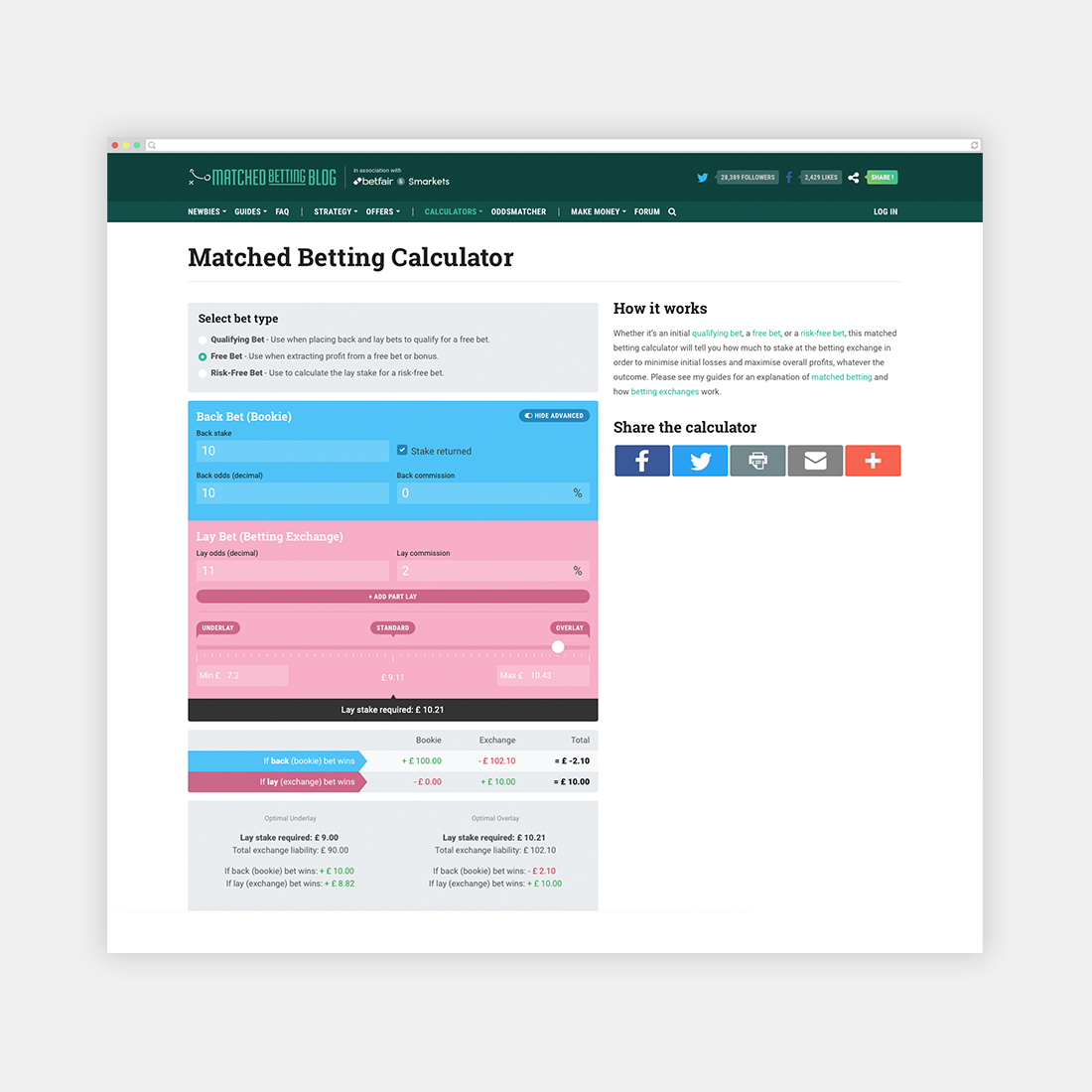
The Matched Betting Blog calculator is simple, responsive, and easy to use. The colour scheme of blue and pink indicates clearly whether the information is linked to a back or lay bet respectively. The separation definition between the sections is obvious and the detailed bet information is appealing to experienced users. Although the calculator excels in these areas, it is built for web and lacks a true dedicated mobile solution; thus rendering it difficult to use on-the-go. An additional quality this calculator lacks is the ability to track bet history, resultantly, the tedious task of manual data entry becomes an unwanted necessity.
Matched Betting Calculator
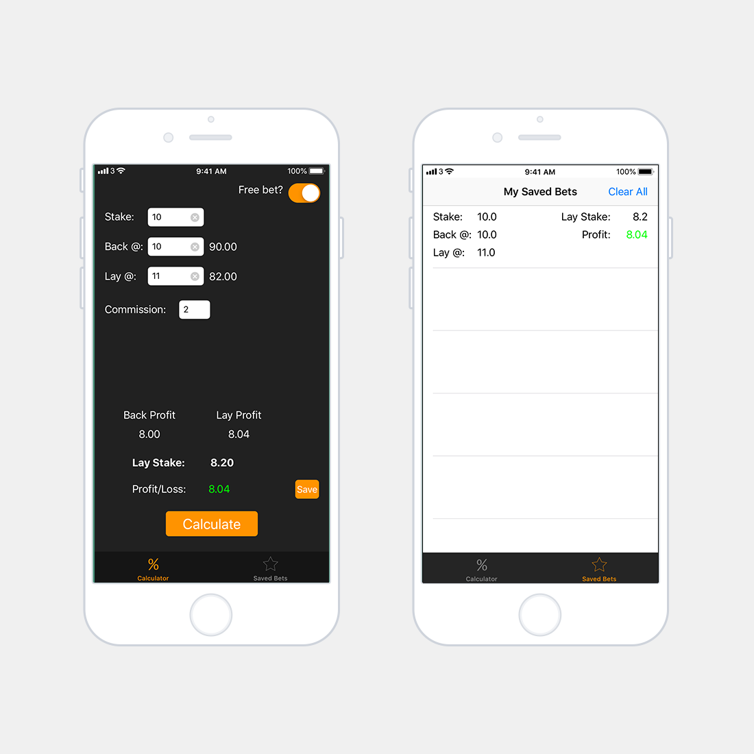
The Matched Betting Calculator is a free mobile application available on the iOS App Store. The application is restricted in terms of functionality and provides a minimum viable product for the majority of qualifying bets (advanced bets are not possible using this calculator). The user interface is simple, but boring, there is no distinct visual definition between back and lay (other than wording). However the required lay stake stands out in bold and the profit/loss is colour coded (green/red) dependant on outcome. Unlike other solutions there is an in-built betting log, the design of this is poor, the most obvious downfall being the lack of entry identifiers.
Audience
The next part of the process was to consider who is likely to use the product and how this may influence and guide the design. This resulted in the creation of two personas, Simon; a 20 year old university student in his second year, and Jess; a 29 year old office worker.
Simon
Persona
Simon is struggling to make ends meet in the current financial climate and doesn’t have time for a part-time job due to course commitments. He seldom places a bet, but often loses and feels like he is giving his money away. He recently stumbled across an article about matched betting and wanted to give it a try. He understands the concept, but isn't confident in his capabilities.
Jess
Persona
Jess is financially stable, however with the holiday season incoming, she could really benefit from some extra revenue. Jess has never placed a bet before. A colleague at work had recently explained to her how he had paid for a holiday utilising the method. She looked into it, but found it overwhelming and gave up on her first try. She’s willing to try again, but just wishes it was easier to understand.
From analysing the behaviours of Simon and Jess, it is possible to find some common ground. Both desire to gain additional revenue, however find the matched betting methodology online confusing and illogical. From this it is possible to deduce that the process should be simplified and designed in way that evokes a friendly and familiar vibe.
Concept
Building upon the research and persona, it was important to deduce core values that the design should abide to. Conducting user interviews has informed the feature prioritisation matrix below. Analysing this, it is possible to derive the neccesary product attibutes for the initial design wireframing mockups.
Wireframe
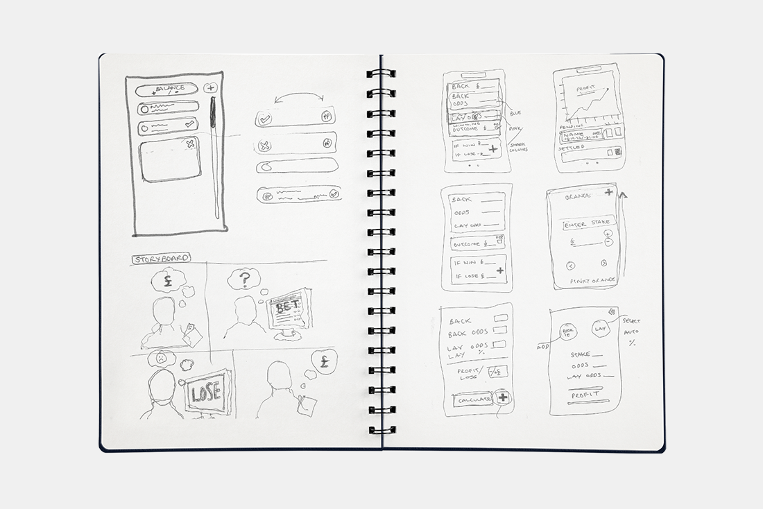
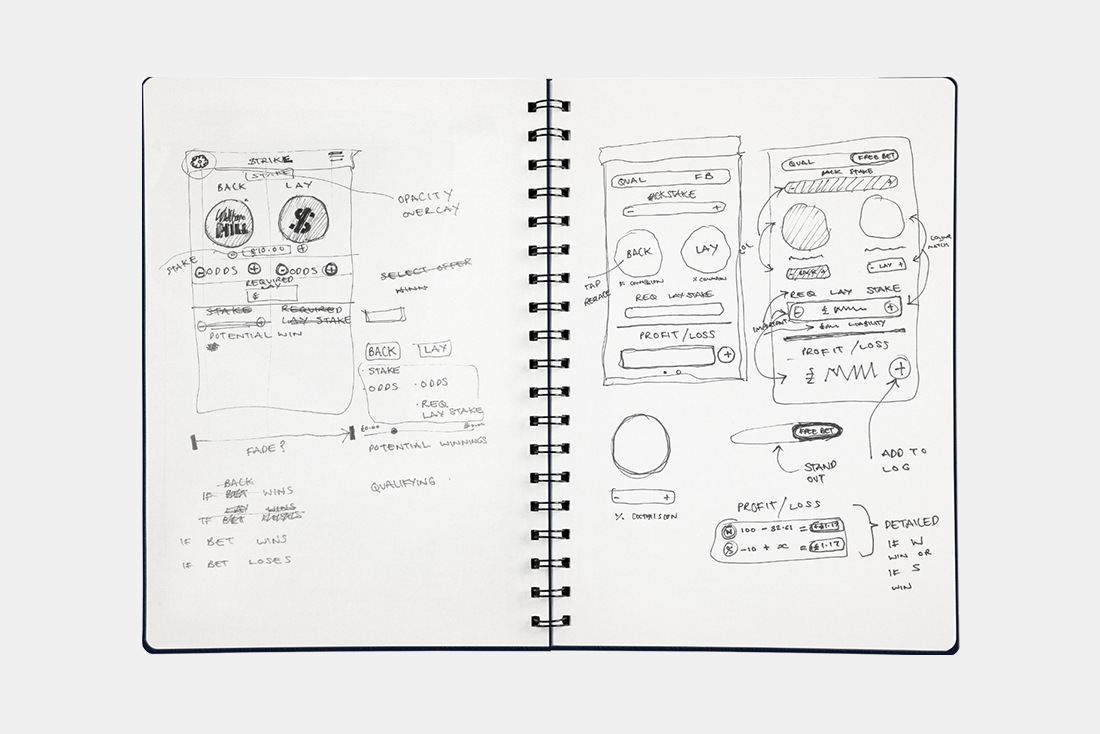
A flow diagram of user input allowed the initial calculator design to follow a logical layout, with steps laid out in hierarchical order from top to bottom.
Development
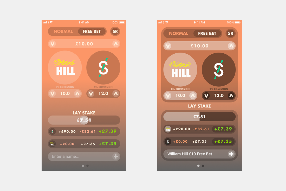
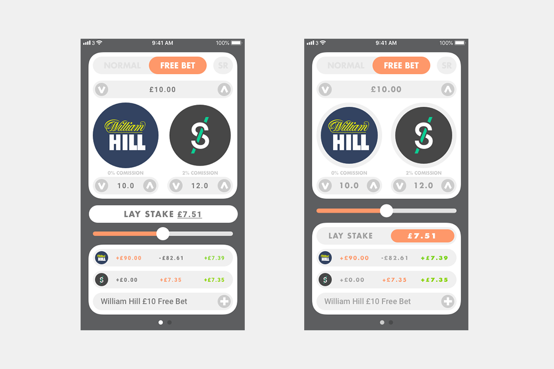
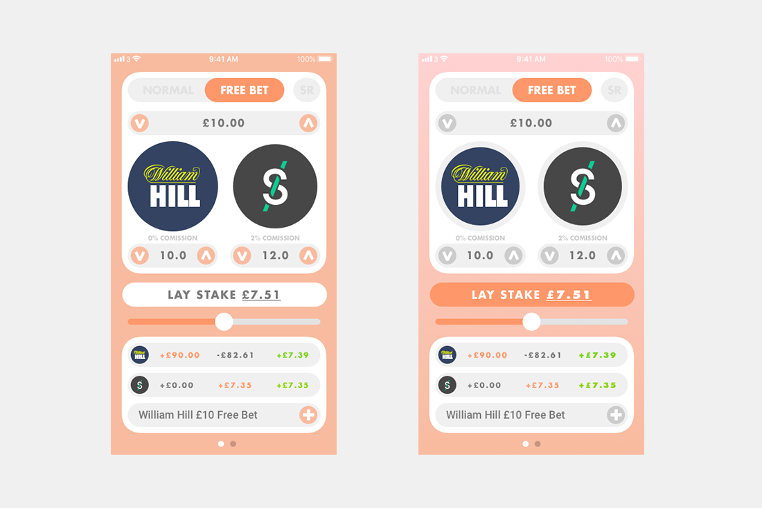
To ensure a succesful product it was important to test out various colour schemes and core UI grouping, arrangement, and balance.
Screenshots
From the analysis and research we can determine that the application should be friendly, simplistic, and logical. Our expected audience are inexperienced individuals who are looking to gain an understanding of matched betting.
Graphical User Interface
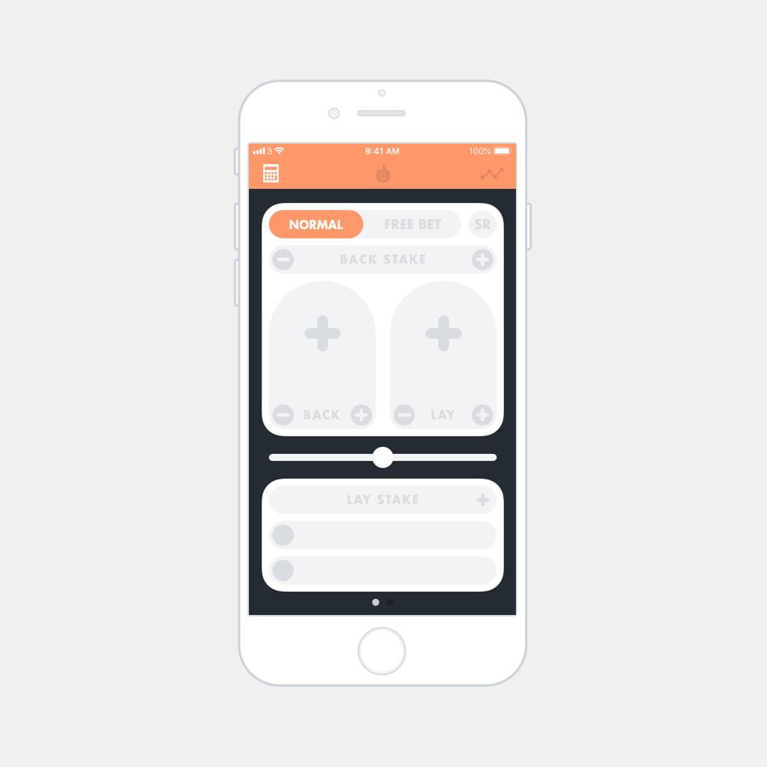
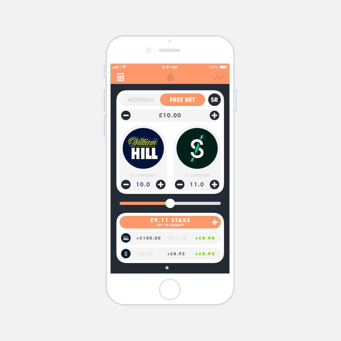
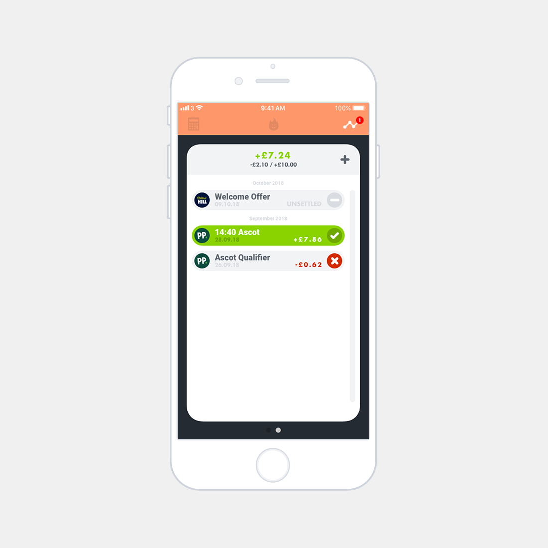
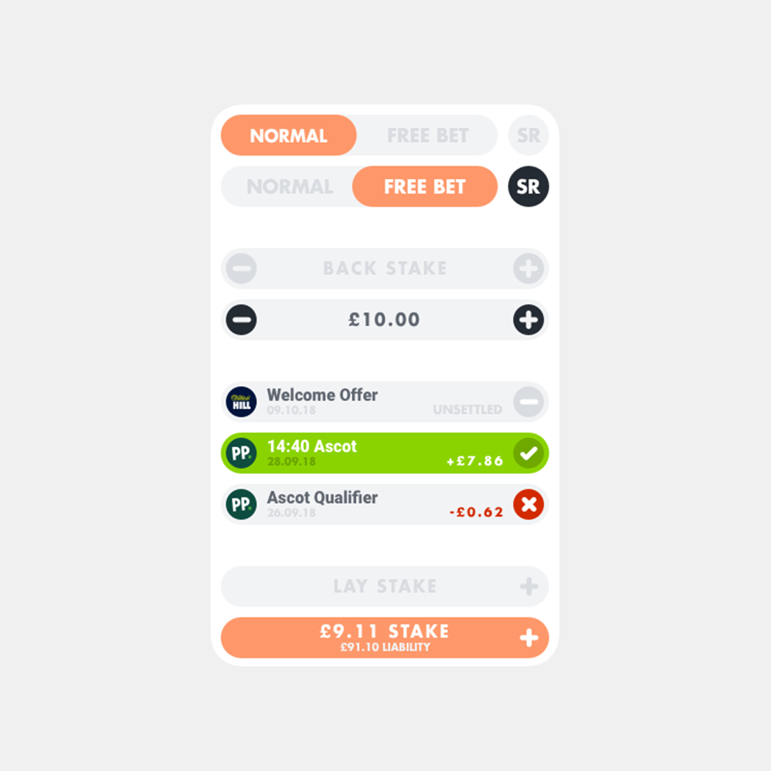
Interactive elements are indicated through the use of coloured fills. Orange fills are given to important interactions that affect significant information (such as calculator type, or lay stake requirement). Black fills are attributed to quick-press interactions (such as changing odds or stake amount). The aesthetics of disabled/unselected elements are shown greyed out with a light grey background, once an element becomes active the text becomes darker. Unsettled bets are indicated through the use of a light grey fill with a grey lined symbol. Positviely settled bets are indicated through the use of a green fill with a tick. Negatively settled bets are displayed with a light grey fill and a red cross symbol. Bets can be identified through the descriptive text, logo of the chosen back bookmaker and to further aid identification the date is also retained as part of the cell.
Prototype
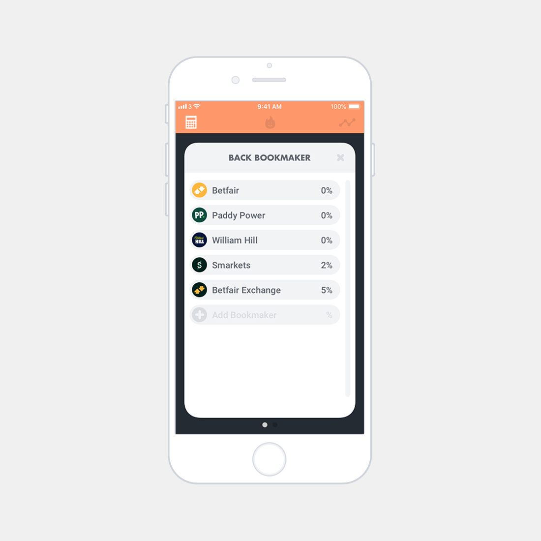
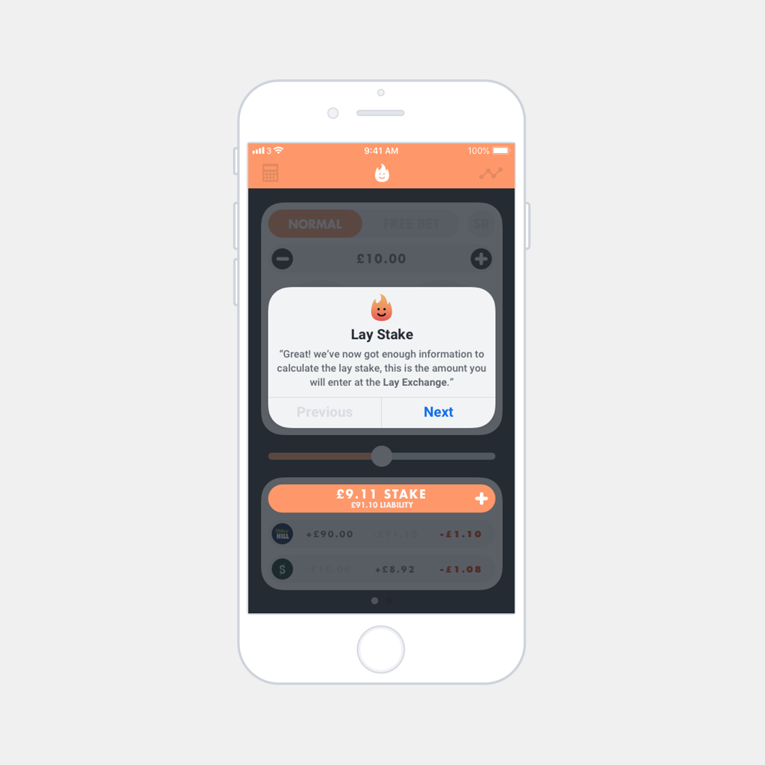
In the demonstrative prototype, the user has just signed up to William Hill and is using the calculator to extract the funds from a welcome offer using Smarkets. At any point 'Ember' may be used to give helpful information. • Login to the application. • Enter a "Back Stake" of £10.00. • Select William Hill as the "Back Bookmaker". • Select Smarkets as the "Lay Exchange". • Increase the "Lay Odds" to 11.0. • Switch to a "Free Bet" with "Stake Returned". • Use the slider to overlay the bet. • Add the bet to the log. • Give the bet an informative identifier. • Add the bet to the log. • Enter the log screen. • Settle the bet positively or negatively and observe the profit/loss.

